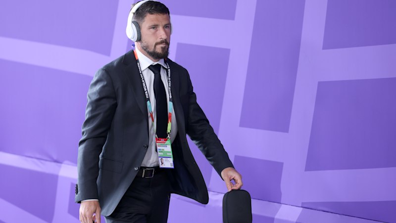
Multiple outlets discuss the range of design approaches used in World Cup uniforms, focusing on standout fashion-inspired kits as well as those that are seen as less distinctive. All three articles frame the topic as a look at how the tournament’s clothing blends sportswear functionality with broader style influences. The pieces highlight high-profile fashion brand involvement and draw attention to specific uniform elements that viewers find particularly notable, including colour choices, logos, and overall presentation on the pitch. While the articles share a common overall theme—evaluating the “best” and “worst” uniforms—their emphasis differs in how they describe individual looks, from more fashion-forward designs to simpler or more generic patterns. Across the coverage, readers are presented with a comparative view of uniforms associated with different teams and kit providers. The articles collectively position the World Cup as an event where kit design becomes part of public discussion, with uniforms assessed not only for aesthetic appeal but also for how clearly they reflect their intended branding and style direction. Overall, the reporting centers on fashion and visual impact rather than on match performance or sporting outcomes.
Coverage highlights designers and styles of 2022 World Cup uniforms
Multiple outlets discuss the range of design approaches used in World Cup uniforms, focusing on standout fashion-inspired kits as well as those that are seen as less distinctive. All three articles fr...
- The articles provide a comparative review of World Cup uniforms, describing both standout and less distinctive designs.
- Coverage emphasizes fashion and visual styling elements of tournament kits, including branding and presentation.
- Multiple sources reference high-profile fashion brands connected with World Cup uniform design.
- The articles are framed as assessing “best” versus “worst” uniform aesthetics rather than reporting on sporting results.
- The focus is primarily on how uniforms look and how they are perceived by audiences.
Chanel, Hermès and Jacquemus: Inside the most stylish sports event in history.
11 hours agoChanel, Hermès and Jacquemus: Inside the most stylish sports event in history.
11 hours agoChanel, Hermès and Jacquemus: Inside the most stylish sports event in history.
11 hours agoFolarin Balogun targets World Cup Golden Boot, chasing Messi and Mbappé
United States striker Folarin Balogun is pursuing the World Cup Golden Boot while aiming to match the scoring output of...

France vs. Iraq World Cup match paused due to thunderstorms in Philadelphia
The Group I World Cup match between France and Iraq at Lincoln Financial Field in Philadelphia is delayed due to severe...

Polymarket extends $50 promo code “OREGON” for sports betting across major events
Polymarket is promoting a $50 invite/referral code “OREGON” that provides new U.S. users with a bonus tied to a $20 depo...