Multiple outlets report on an interactive map that shows how Brisbane’s population changes across suburbs over the past year. The coverage highlights that Brisbane’s overall population is growing, while specific suburbs experience different outcomes, including both growth and decline. The articles focus on where people are moving within the city and which areas new residents choose to live in. Rather than presenting a single set of figures in the text, the reports point readers to the map to examine suburb-by-suburb results, including the scale of increases or decreases. The information is framed as a way to understand shifting residential patterns across Brisbane, including variation between suburbs. Across the sources, the common theme is that demographic movement is reshaping where residents live, and the interactive tool is designed to help users identify the changes in their particular suburb. The reports do not attribute the changes to specific causes, instead emphasizing the availability of localized data through the map.
Interactive map tracks population changes across Brisbane suburbs
Multiple outlets report on an interactive map that shows how Brisbane’s population changes across suburbs over the past year. The coverage highlights that Brisbane’s overall population is growing, whi...
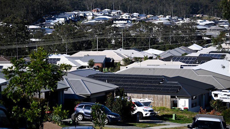
- An interactive map shows population changes across Brisbane suburbs over the past year.
- Brisbane’s population is reported as growing overall, but suburbs differ.
- Some suburbs experience population increases while others see declines.
- The map is intended to help users see who is moving and where people choose to live.
- The articles direct readers to check suburb-specific results using the interactive tool.
Brisbane’s population is growing – but who’s moving here, and where are they choosing to live? Explore our interactive map to see what’s happening in your suburb.
2 hours agoBrisbane’s population is growing – but who’s moving here, and where are they choosing to live? Explore our interactive map to see what’s happening in your suburb.
2 hours agoBrisbane’s population is growing – but who’s moving here, and where are they choosing to live? Explore our interactive map to see what’s happening in your suburb.
2 hours ago
Opera rankings list the most notorious “evil” characters in the repertoire
Multiple Australian outlets—Brisbane Times, The Age, and the Sydney Morning Herald—publish the same feature titled “Bad...

Courteney Cox and Johnny McDaid reportedly end relationship after more than a decade
Courteney Cox and Snow Patrol musician Johnny McDaid have reportedly ended their relationship after about 13 years toget...

S&P warns post-COVID debt pressures may force state service cuts, except one
S&P Global says Australia’s state governments face growing pressure from post-COVID debt levels, with the rising cost of...