


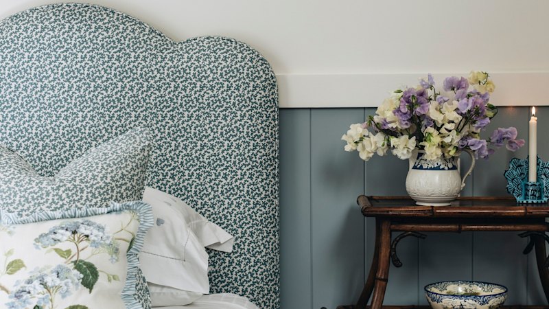
Multiple Australian outlets publish design guidance on how to combine bold patterns, florals and prints in a single room without making the space feel overwhelming. The articles focus on creating a “luxe” layered look by pairing different textiles and patterns in a coordinated way.
Across sources, the core approach is to use similar color tones across the various prints—for example, keeping paisleys, florals and other pattern elements within the same shade family. This coordination is presented as a way to maintain visual harmony while still allowing the room to look interesting and styled rather than flat.
While the outlets share the same overall message, they each frame the advice as a practical way to balance character and calm. The emphasis is on layering (rather than choosing one print type), and on ensuring the different designs work together through consistent colour selection. Overall, the articles present the same styling concept with minor differences in wording, presenting a unified set of recommendations for home decor.