


Spotify temporarily replaced its regular mobile app icon with a green, 3D disco-ball style logo to mark its 20th birthday, and the change sparked a wave of criticism online. Multiple outlets report that users reacted negatively to the updated icon, with some social media comments describing it as unattractive and drawing broader attention to the issue. In response to the backlash, Spotify says the disco-ball image was never intended to be permanent. The company states that the “temp glow up” ends shortly and that the standard, 2D version of its logo will return to users’ phones next week. Spotify also frames the move as part of a promotional anniversary effort, tied to an in-app “Your Party of the Year(s)” experience, described as similar in concept to Wrapped-style campaigns. Coverage also notes that the logo swap prompted designers and brand accounts to create their own disco-themed icon reactions, turning the temporary change into a social-media moment. Overall, the reporting indicates Spotify acknowledges the backlash publicly and confirms the regular logo will resume as scheduled.
Spotify withdraws temporary disco-ball app icon after user backlash
Spotify temporarily replaced its regular mobile app icon with a green, 3D disco-ball style logo to mark its 20th birthday, and the change sparked a wave of criticism online. Multiple outlets report th...
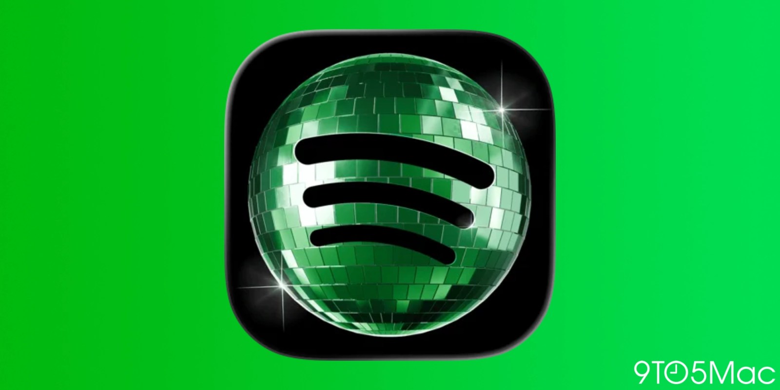
- Spotify temporarily replaced its usual mobile app icon with a disco-ball themed version to mark its 20th birthday.
- Some users criticize the disco-ball icon online, leading to a backlash across social media.
- Spotify says the disco-ball icon change is temporary and acknowledges that “glitter” is not for everyone.
- Spotify states the regular logo will return to users’ phones next week.
- The disco-ball icon is linked to a 20th-anniversary promotional effort described as “Your Party of the Year(s)."
Who hates a sparkly disco ball? Turns out a vociferous swath of Spotify users do. A short-term swap of its regular mobile app icon for a 3D mirrorball version to celebrate a company milestone has set off an online kerfuffle.
3 months agoEveryone hates Spotify's new green disco ball app icon. It's a mess. But it worked.
3 months agoThey’re calling it “discomorphism.” To mark its 20th birthday, Spotify introduced a revamped logo that bedazzled its green, circular mark into a shimmering dark green disco ball. Following backlash online, Spotify assured its users that the old logo is coming back soon. “Alright, we know glitter is not for everyone,” the music streaming service said on social media. “Our temp glow up ends soon. Your regularly scheduled Spotify icon returns next week.” Alright, we know glitter is not for everyone. Our temp glow up ends soon. Your regularly scheduled Spotify icon returns next week.— Spotify (@Spotify) May 17, 2026 Spotify tells Fast Company the disco ball icon was always supposed to be a temporary change for the anniversary. It was part of the streaming platform’s “Your Party of the Year(s)” promotion— a Wrapped-style in-app experience built for its 20th anniversary. Temporary or not, it’s not surprising that the update rankled many of Spotify’s users. “People think reactions like this are about a logo, but they are usually about emotional familiarity and subconscious trust,” says Ravi Sawhney, founder and CEO of the industrial design consultancy RKS Design. Even subtle visual changes can create a feeling of disruption. [Image: Spotify] This isn’t the first time Spotify has played around with its logo. It has redesigned its mark for promotional moments like Wrapped, including last year’s, which paid homage to artists like Lady Gaga, PinkPanthress, and Justin Bieber. But none of the other updates have struck a nerve like its disco design. [Images: Spotify] These orchestrated brand moments—outrage-inducing or not—are ultimately a play for attention, and attention is exactly what Spotify got. After rolling out the temporary logo, designers and brand accounts responded to Spotify’s new look by bedazzling their logos and icons. The disco ball became its own visual filter, where participants treated the limited-time Spotify logo like a pop star’s album art reveal meme cycle. Love it or hate it, it worked out for Spotify. The company says the only thing that’s come from online chatter is more new subscribers.
3 months agoHaterade rained down on Spotify’s 20th birthday party celebratory disco-ball icon — and, after acknowledging the backlash, the streamer says the old 2D logo will return to users’ phones next week. Without warning, Spotify last week debuted the glowing green mirrorball icon for its mobile app for Apple’s iOS. It was meant to be a […]
3 months agoSpotify recently changed the app icon for its mobile app, and not everyone appreciates the celebratory disco ball logo. more…
3 months ago
Tony Abbott calls for a separate museum to commemorate Australia’s frontier wars
Former prime minister Tony Abbott says the Australian War Memorial is not the right place to focus on Australia’s fronti...

Queensland passes controversial government powers expansion as renewables rules change
Queensland MPs return to parliament after a late sitting in which legislation expanding government powers passes, accord...

Northern senators urge federal government to rescue abducted victims from Niger mosque attack
Northern Senators Forum and allied lawmakers and groups call for the immediate rescue of people abducted during an attac...