


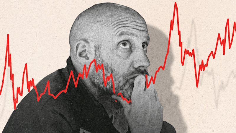
Markets follow a widely watched indicator often described as a “fear gauge,” created by Nobel Prize-winning economist Robert Shiller. The story across outlets centers on how this metric is used by investors to gauge whether risk sentiment is turning more anxious, and how that shift can coincide with periods when Wall Street is considered vulnerable.
The articles present the same basic framing: the indicator has become one of the most cited numbers for assessing market mood. However, the outlets differ mainly in tone and emphasis, with the “red alert” language suggesting heightened concern rather than asserting that a crash is certain. They collectively point to the idea that extreme readings can be a warning sign for investors, while still relying on interpretation rather than a guaranteed outcome.
Overall, the coverage treats the chart as a tool for monitoring investor fear and shifting expectations, not as a direct forecast. The common thread is that changing levels in the gauge are associated with heightened market caution, prompting renewed scrutiny of downside risk.