


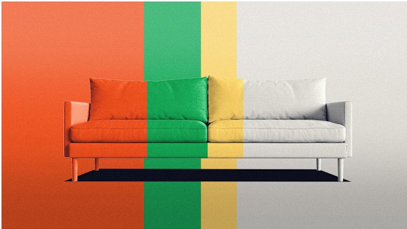
The reports describe an analysis of changing interior design tastes, focusing on how neutral tones increasingly replace more brightly coloured furniture in living rooms. They frame the trend as a response to evolving aesthetics and consumer preferences, arguing that some spaces can feel “lifeless” when colour saturation declines.
Across the outlets, the central point is the same: cheerfully coloured sofas and other vivid furnishings become less common over time, while beige, grey and other neutral palettes come to dominate. The articles present the change as a gradual, broader style shift rather than a single event, and they emphasize the visual and cultural reasons people may perceive more muted rooms differently.
While the outlets do not highlight different findings, they vary slightly in tone and phrasing—one presenting it as an explanation for lifeless-looking rooms, another describing it as a “quirky analysis.” Overall, the coverage aligns on the trend’s direction (toward neutrals) and its focal example (sofas), without disputing the basic narrative of how and why it spreads.