


“Greetings from” postcards feature colorful scenes of states, cities, and tourist attractions paired with large, stylized lettering. Across outlets, the emphasis is on how the cards advertise more than a location: the format highlights visual design choices that make places recognizable and inviting in a compact space. The tiny, enclosed images in these postcards are presented as a deliberate design constraint rather than a limitation, using scale, bold typography, and bright color to convey travel appeal. The descriptions also connect the cards to broader themes of American innovation and idealism, suggesting the enduring popularity of the genre reflects both creativity in commercial graphic art and optimism associated with travel and exploration. Overall, the sources describe the “Greetings from” style as a specific branding approach that turns public destinations into collectible, easily distributed visuals—combining location marketing with distinctive design elements. The discussion focuses on what the postcards communicate visually and culturally, without adding new event-based reporting.
“Greetings from” postcards showcase American travel branding and graphic design
“Greetings from” postcards feature colorful scenes of states, cities, and tourist attractions paired with large, stylized lettering. Across outlets, the emphasis is on how the cards advertise more tha...
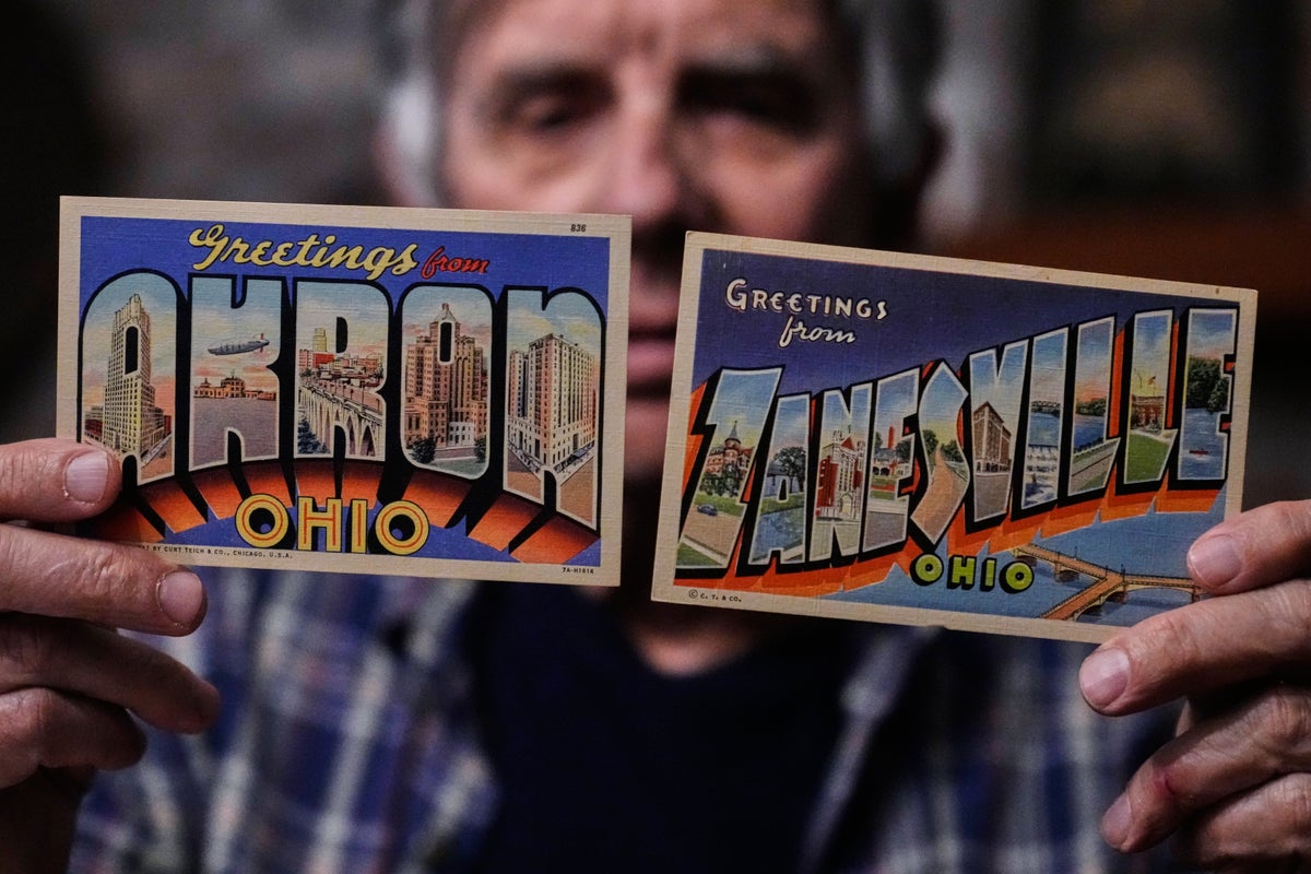
- “Greetings from” postcards display large, stylized lettering reading “Greetings from.”
- The cards advertise specific places such as states, cities, and tourist attractions.
- Their artwork condenses destination imagery into small scenes arranged around the typography.
- The design uses bright, colorful visuals intended to make destinations appealing and recognizable.
- Sources connect the postcard style to themes of American creativity and optimism about travel.
Postcards emblazoned with “Greetings from” a state, city or tourist attraction advertise more than just the tiny scenes squeezed into 3D letters
3 months ago
Harry Potter cast debate JK Rowling’s views ahead of new series
Several outlets report heightened public discussion around JK Rowling’s statements on transgender issues as anticipation...

Aaron Sorkin’s “The Social Reckoning” releases full trailer ahead of October 9 theatrical debut
Sony Pictures releases the full trailer for Aaron Sorkin’s upcoming film “The Social Reckoning,” the follow-up to David...

Rupert Grint to reprise Ron Weasley on Broadway in “Harry Potter and the Cursed Child”
Rupert Grint, who played Ron Weasley in all eight “Harry Potter” films, is set to return to the franchise on Broadway by...