

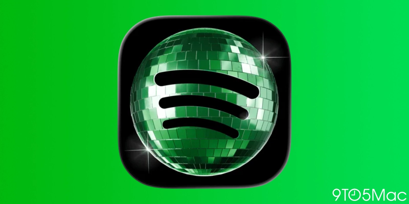
Spotify is reverting its iPhone app icon back to the original design after introducing a disco-ball-themed logo tied to its 20th anniversary celebrations. Multiple outlets report that the disco-ball icon appeared as a short-term change intended to draw attention to Spotify’s milestone content. Users raised complaints during the roughly month-long period, saying they disliked the updated appearance and in some cases noting that the logo looked pixelated or visually unpleasant on small screens. Spotify had previously acknowledged the change was temporary and reassured users that it would be rolled back in “a few weeks.”
Reports indicate that an iOS app update released around June 11 restores the original 2D icon. Coverage also links the redesign to Spotify’s “Spotify 20: Your Party of the Year(s),” an in-app experience focused on users’ listening history and year-by-year highlights. While some users expressed support for the creative, festive approach, the overall reaction led to the company bringing back the classic icon on iOS.