


Multiple outlets publish the same opinion-style piece that reflects on visual styling in “The Devil Wears Prada.” The article notes that even Meryl Streep’s red Balenciaga dress appears less striking than expected, describing it as comparatively subdued within the production’s or coverage’s overall look. The writers attribute this effect to a broader trend toward muted colour palettes across screens, suggesting that contemporary visual media—whether in the film itself or in how it is presented—leans toward toned-down colour choices. Rather than providing new reporting or verifiable details about specific production changes, the piece focuses on audience perception, comparing how the dress looks against the surrounding colour scheme. The central argument across the sources is that the subdued palette dampens the visual impact of standout garments, resulting in colours that read as muted rather than bold.
Commentary questions subdued colour palettes in recent “The Devil Wears Prada” coverage
Multiple outlets publish the same opinion-style piece that reflects on visual styling in “The Devil Wears Prada.” The article notes that even Meryl Streep’s red Balenciaga dress appears less striking...

- The articles comment on “The Devil Wears Prada” styling and audience perception.
- They say Meryl Streep’s red Balenciaga dress appears less striking than expected.
- They attribute the effect to a broader trend toward muted colour palettes on screens.
- The piece is opinionated and focuses on visual impact rather than new facts or reporting.
Even Meryl Streep’s red Balenciaga dress appeared more subdued than striking. What’s with the muted colour palettes taking over our screens?
3 months agoEven Meryl Streep’s red Balenciaga dress appeared more subdued than striking. What’s with the muted colour palettes taking over our screens?
3 months agoEven Meryl Streep’s red Balenciaga dress appeared more subdued than striking. What’s with the muted colour palettes taking over our screens?
3 months ago
HBO Max orders DC Studios mockumentary series “The People v. Gorilla Grodd”
HBO Max officially orders an eight-episode mockumentary series set in the James Gunn-led Superman universe, titled “The...

Kuku Kohli funeral in Mumbai attended by Aruna Irani and film fraternity
Filmmaker Kuku Kohli, 77, dies on August 25 in Mumbai after a heart attack, and a funeral and prayer-related events are...
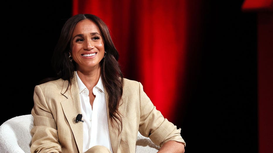
Meghan Markle rumored to be in talks for Netflix’s The Gentlemen season 3
Meghan Markle is reported to be in talks about appearing in Netflix’s “The Gentlemen,” a Guy Ritchie gangster series, as...