


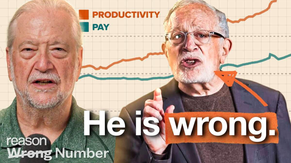
A commentary piece challenges the accuracy of an infographic attributed to former U.S. Labor Secretary Robert Reich that compares chief executive compensation with worker wages. The author argues that the chart uses “wrong math,” presenting figures in a way that can mislead readers about how CEO pay has changed relative to pay for typical workers over time. According to the critique, the underlying calculations and comparisons are not consistent with the economic data the chart appears to rely on, and that errors in how the numbers are adjusted or interpreted change the conclusions a viewer would draw from the graphic.
The piece frames the issue as a matter of methodology rather than policy, saying the debate should focus on transparent, correct computations when analyzing income trends and inequality. It also implies that readers should verify the assumptions and formulas behind public-facing charts, particularly when those visuals are used to support broader claims about economic fairness.
Overall, the discussion centers on whether Reich’s presented data accurately reflects CEO compensation and worker wage trends.