

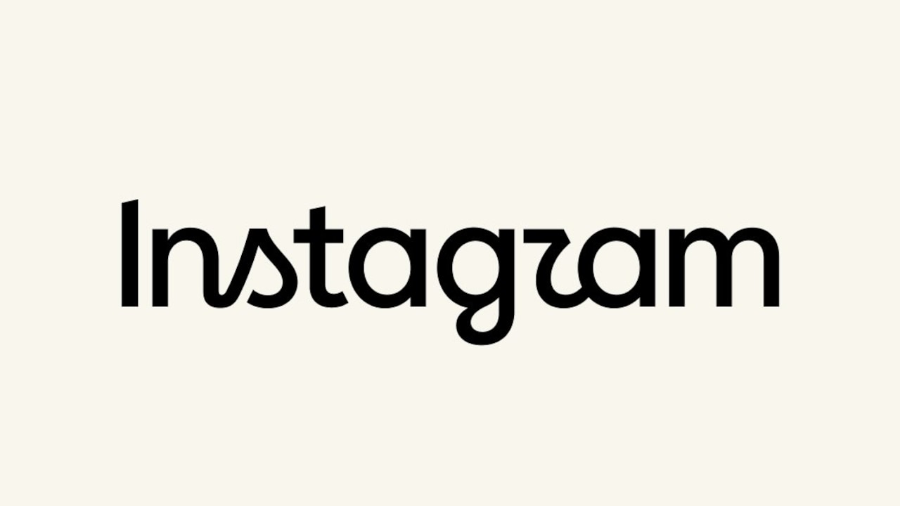
Instagram introduces a redesigned text-only wordmark logo, updating how the company name appears across its platforms. The change is announced by Instagram head Adam Mosseri on both Instagram and Threads. Mosseri describes the new design as “sharper and more modern,” while also keeping a visual connection to the earlier wordmark.
The company presents the update as its first major visual change in about ten years, noting that the previous wordmark had started to feel dated. The new typography incorporates cursive-style curves in parts of the letters, including the “s,” “r,” and “g.” That design choice draws mixed reactions online, with some users praising the fresher look and font update and others raising concerns that the letter shapes, particularly the “r,” can make the wordmark appear to read differently.
While outlets agree on the rollout and Mosseri’s description, their emphasis differs slightly: some focus on the redesign’s aesthetic framing, and others highlight public reactions and specific letter-shape concerns. All sources point to the last major Instagram branding change occurring in 2016, when the company moved to its then-new cursive-style wordmark.